Customise your visuals
Favicon, Logo and Banner Image
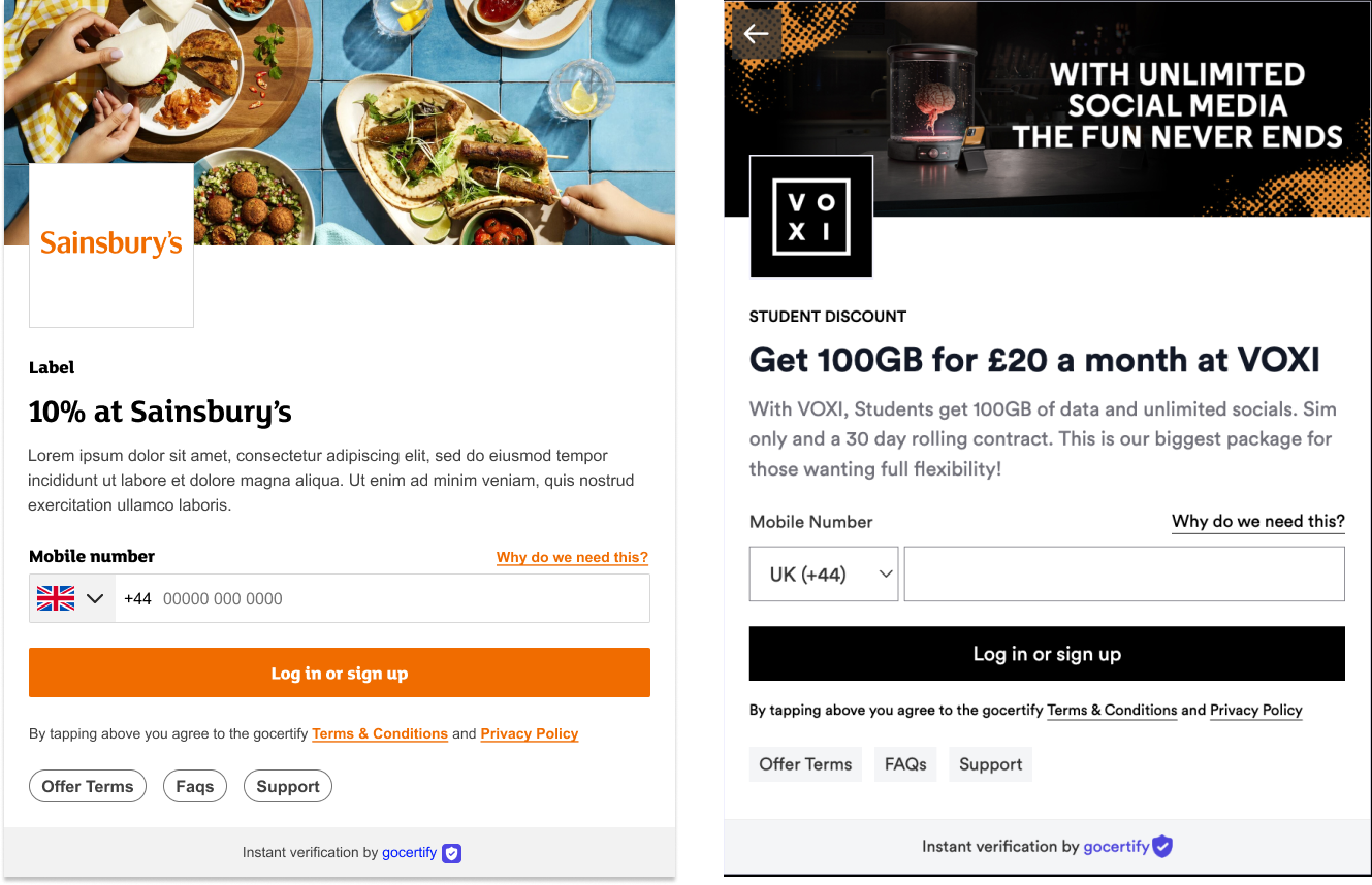
The brand logo and banner image is shown on the key screens throughout the reward flow and the favicon is shown on any Gocertify hosted landing pages that you may link to. Provide your Gocertify account manager with the image files of the correct dimensions (listed below), and we will handle the rest.


Fonts
You can provide up to 4 font files to customise the heading, normal, tagline and fineprint text. These fonts will be applied throughout the reward flow as detailed below: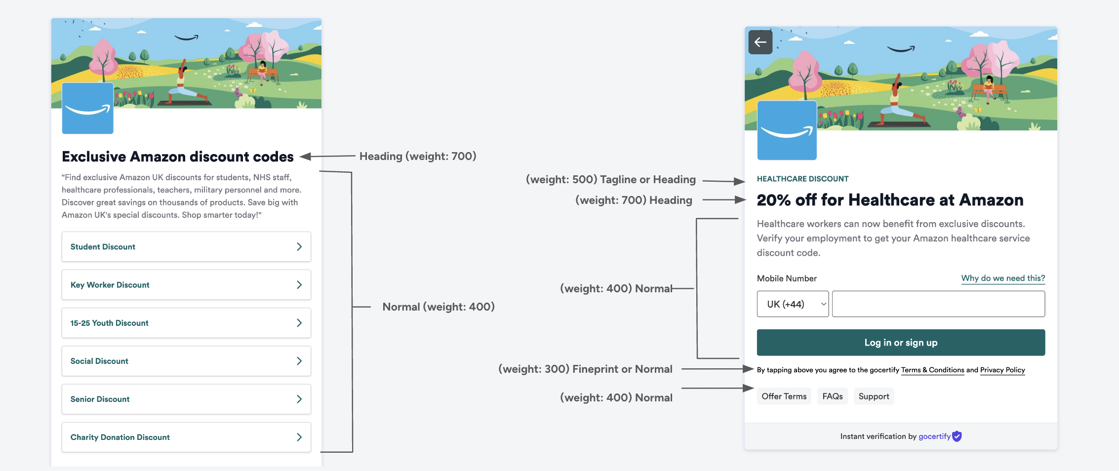
Custom Styling
The Advanced CSS option let’s you can go even further with your customisation. Your customer success manager will be able to help you build and apply any customisations you need, but for inspiration the most popular customisations are captured below. The Advanced CSS section has even more examples.Hide iFrame Brand Logo
Hide iFrame Brand Logo
Hide iFrame Banner Image
Hide iFrame Banner Image
Customise fonts
Customise fonts